
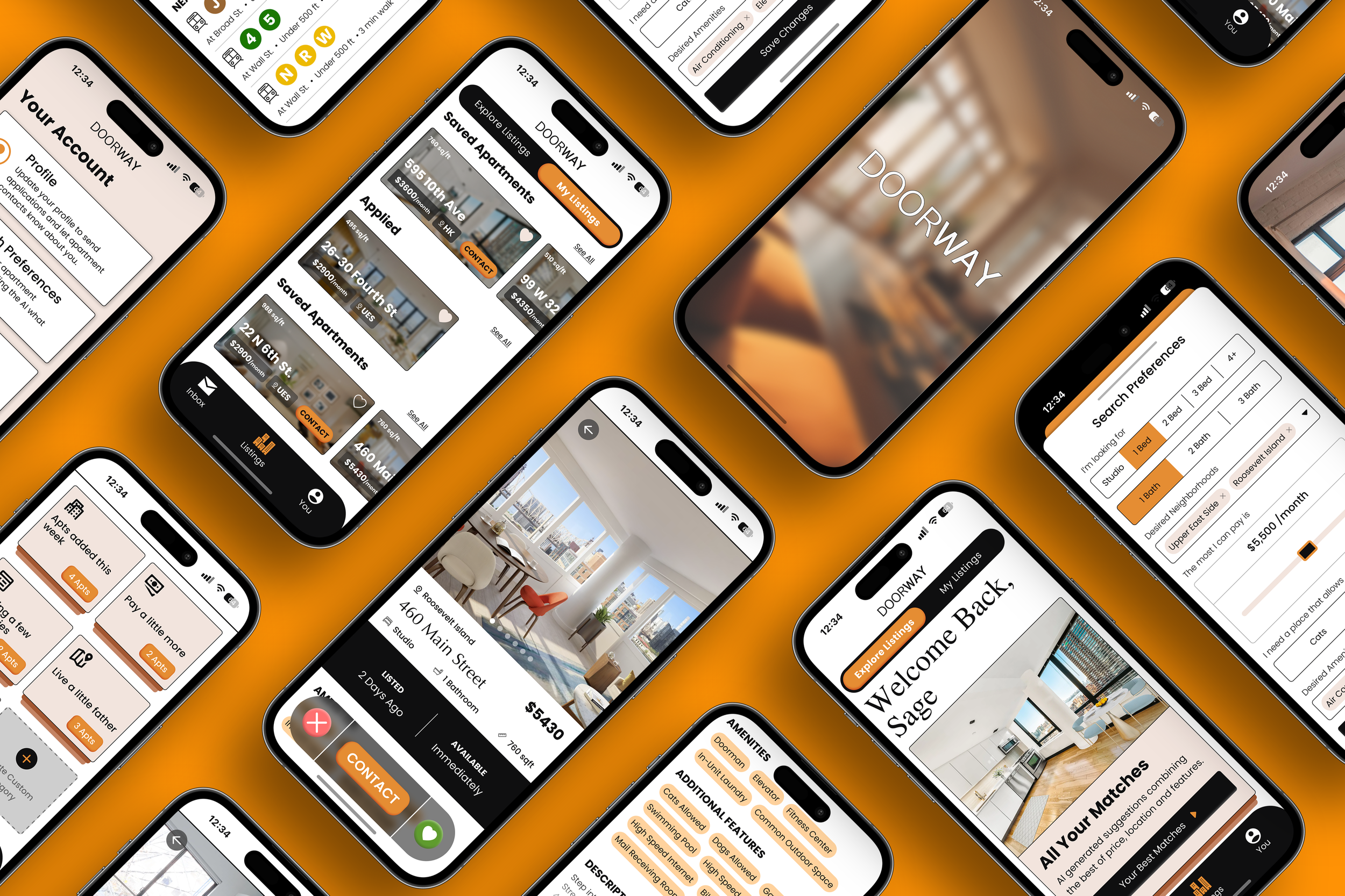
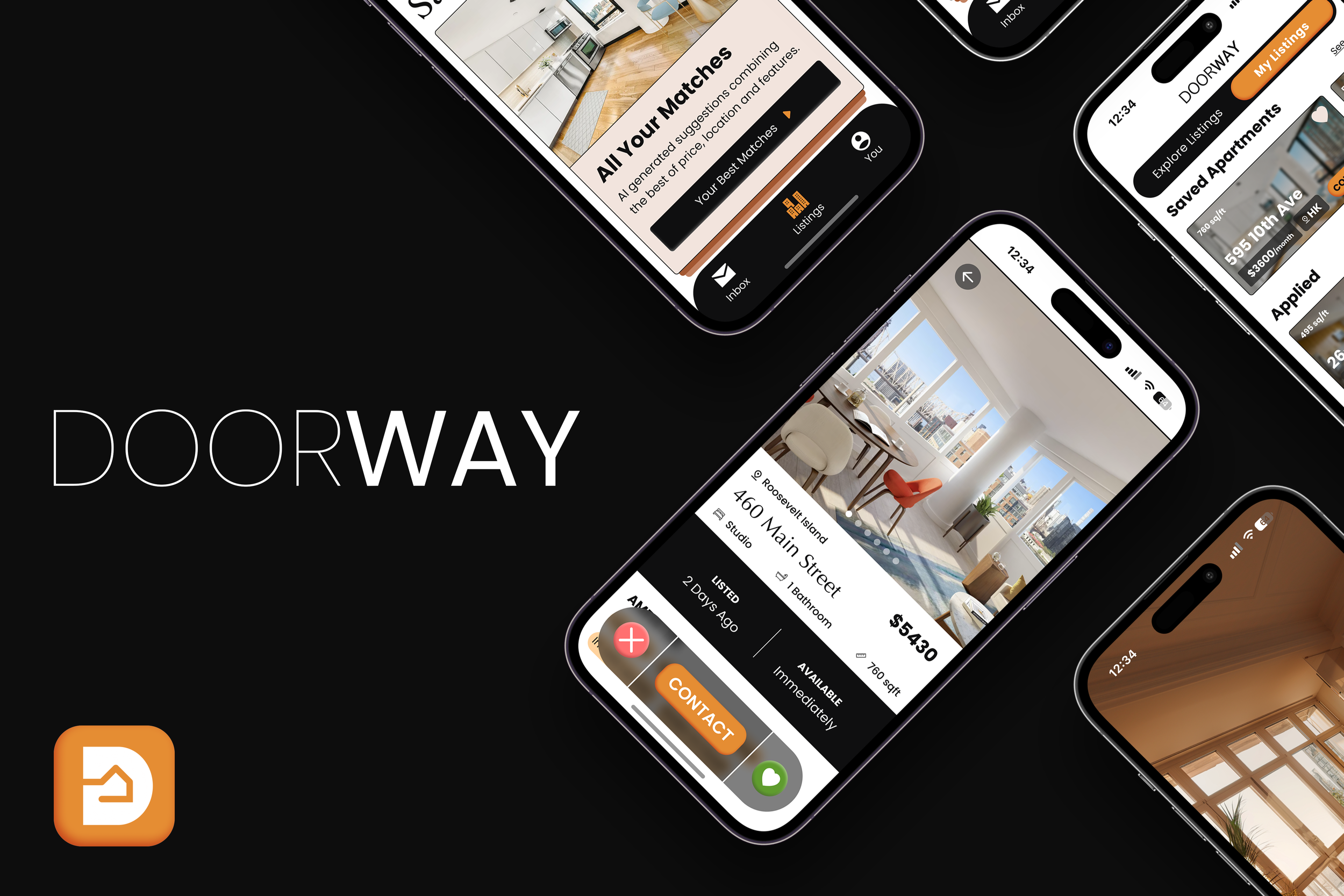
DOORWAY
Mobile
App Design
Timeline
2 weeks
(70 hours)
My Role
UX Researcher
UX Designer
Tools
Figma
Photoshop
NYC Apt Hunt: The Struggle is Real
Apartment searching in NYC is overwhelming, with users spending 2+ hours weekly and 63% feeling frustrated.
From Frustration to "Finally!"
Doorway offers a personalized apartment search through a machine-learning filter, akin to dating app functionality.
What I Learned from NYC Renters
Top Priorities: Price, location, unit size.
Visual Content: High-quality photos, videos, and AR/VR tours are critical.
Desired Features: Searches by "special" amenities (e.g., pet-friendly, natural light), mandatory high-resolution visuals, and preference-based filter systems.
Relocating in NYC can be exciting, but finding an apartment shouldn't add to the stress. Whether you're a tech wiz, a digital nomad, or need a flexible lease, Doorway understands your needs. We use AI to match you with apartments, prioritizing affordability, convenience, and your unique lifestyle.

Designs
From Ideas to Interactive Experiences
See my design process unfold, from initial sketches to high-fidelity wireframes.
Usability Insights: Enhancing Visual Appeal
During usability testing, the intuitive nature of Doorway shone through, yet it was the detailed feedback on feature functionality that provided invaluable insights for improvement:
Users found the innovative search filter and AI-suggested listings beneficial but indicated a need for more precise navigation cues and interactive guidance.
The Explore/My toggle, while appreciated for its concept, was often overlooked; participants suggested enhancing visibility and interaction feedback to ensure no feature goes unnoticed.
Mixed feedback on the app's layout and functionality, such as the effectiveness of the progress bar when viewing listings and the perceived tone created by so many rounded edges in UI elements, pointed towards a broader request for a more streamlined and user-friendly interface.
Priority Revisions

Primary CTAs received a depth redesign to enhance the user experience by clarifying interactions.

All primary CTAs now boast a new design with added depth, making them stand out and improving user interaction clarity.

The listing's "Apply" CTA received a visual refresh and text change to "Contact" for clarity and a more unified user experience.

Listings screens underwent a revamp for a cleaner, more elegant layout, removing unnecessary progress nodes and maximizing image size for smoother browsing.

App squares and frames received layered designs for depth and reduced roundedness for a more elegant, modern feel.
Bringing Doorway to Life: V2 App Screens
Explore the app's polished design and user-friendly interface.
Prototype
Design Learnings: Function & Feeling
This project highlighted that a great user experience goes beyond just working well. It should also feel good to use! I aimed to match the target audience's modern style while creating an efficient app—every choice aimed for that luxurious feel, from the dating app inspiration to the color scheme.
However, user testing showed areas for improvement in the visual design. While users loved the functionality (100% success rate), some color choices and buttons needed tweaking. It's a designer's job to be flexible and adapt based on user feedback, and that's exactly what I'll do to make Doorway even better.
Ready?